The one thing missing from these answers is that “spatial frequency” (as this is called in vision/neuroscience) is a biologically-meaningful concept too. Neurons in early visual areas extract spatial frequency information, and it’s maintained in (largely) separate channels as that information flows through the brain.
Wow! If you're look carefully for a short time, it is only Einstein. If you look diffusely for a while, it is only Marilyn. (For instance, squint and move the image around)
Try walking away from the computer and looking at it from far away. Here it is with increasing amounts of low pass filtering:
https://i.imgur.com/orsZe0n.jpg
Ever since getting Lasik done, I struggle to de-focus my eyes. This one was especially tricky, but walking away from the screen did the trick. I’d done that before you suggested, but appreciate the suggestion as well as the link.
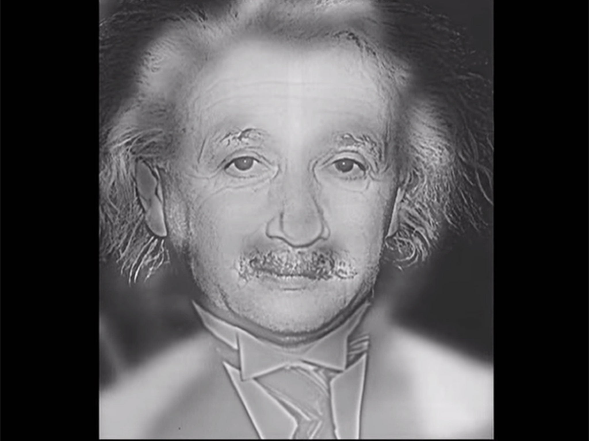
I honestly can't see Abraham Lincoln there, except the small portrait at the bottom left. Is that the point?
I just don't get modern art- anything after the impressionists. I normally make an exception for the surrealists, like Dali, but this one is not in the "exception" group, I think.
Lincoln is hidden in the low frequencies in the image. One way to filter out the high frequencies is to step back a bit from the display, another is to squint your eyes, resize the image, or just use a low pass filter in an image editor.
Or, if you're a myopic glasses-wearer, simply try on-off. I love this trick for images of all kinds because it allows me to apply a uniform blur, no computation required.
You might need to be further away (or try squinting).
Spatial frequency is often reported in cycles/degree. A cycle is one complete set of transitions (light->dark->light) and a degree is the angular distance (1/360th of a circle; about the size of your thumbnail at arm's length). These units are handy since they don't depend on the thing you're looking at or how far away it is.
Human spatial frequency sensitivity peaks between 1-10 cycles/degree, depending on how old you are, to see Ol' Abe, you ought to be far enough away that your thumbnail covers at least five of the tiles.
The small portrait is reproduced in the larger one. The pixels of the beard are around the bottom of the window, the ear is the lighter blocks to the left, and his right eye is her head in the center.
You have to be far away (20m away for the original) or squint a bit/cross your eyes and the big picture starts looking like the tiny portrait of Lincoln that you mention.
You can also save that picture on your device and look at the generated thumbnail. Resizing it makes it a lot more obvious.
Conversely, moiré patterns can be understood as a result of high spatial frequencies being folded to lower frequencies due to insufficient band limiting (provided by an optical low pass filter in front of the image sensor) and thus violating Shannon's principle. This isn't an accident, we simply prefer sharper images that possibly contain spatial aliasing over less sharp (i.e. less high frequency content) images that never contain spatial aliasing.
The reason why moiré patterns are generally colourful is because each pixel is not sampled at a point, but with the colors distributed over some area. Hence each color component of a pixel sees a slightly phase shifted component of the signal, i.e. it gets rainbowy. You would expect the moiré exhibited by a planar sensor like the Foveon X3 to show this effect to a lesser degree.
The best answer to this question is actually provided by Ouss which is only at 1 up vote. Showing the 1d case for frequency of an image is far more illuminating than showing the 2d case.
Most people with a mathematics, or music background of any level understand frequency in terms "hertz". Aka speed of vibration. Translating it to speed of change of pixel value per pixels is difficult without the 1d case.
Yeah, I don't know. Ouss' answer doesn't quite spell out what the repeating event is in the context of the image. He shows a formula that calculates pixel intensities with an "f" cosntant, but doesn't explain what that "f" is and what it does to the pixel intensities. I mean, it's so easy to say "frequency in an image is the rate of change of pixel intensity".
Sometimes when someone asks a question about something simple you have to just spell it out as simple as possible.
(Another thing that works for me given a 2d image like Ouss' example is "think of looking at a sine wave from above" much as this makes no real sense).
Yes, I really liked this, because it was well structured and has the style I understand best.
What was interesting to me, was the irritating effect the high frequency image has to my eyes. It's like I need to move my eyes very fast when I look at that picture.
An interesting - and somewhat intuitive - observation is that the sharper the focus the higher the spatial frequencies go (this is pretty obvious when viewing a composite video signal on an oscilloscope while adjusting the camera focus - the peaks are 'pointiest' at best focus).
In the 1D case, consider a dashed line. With perfect focus this is equivalent to a square wave (which is a sum of all the odd harmonics of the fundamental frequency). Loosely, the blurrier the image of the dashes the lower the frequency content - eventually blurring to 50% grey which is essentially DC.
When stackexchange or wikipedia articles appear on HN I always wonder what the context is. Presumably something triggered interest in this topic recently?
In this case image frequency can be useful in many things from image/video compression to hashing images (to efficiently compare if images are similar, even in the presence of cropping etc). So I'm curious as to what in particular motivated posting this now?
I think it's just interesting to a lot of the HN audience. A modal HN reader stumbled across the post, they found it interesting, they thought it would be good to post on HN, and it was.
I think it's interesting to the modal HN viewer because although FFTs are pretty neat intrinsically, but most people are exposed to FFTs through sound processing (if they are exposed to Fourier Transforms at all, I don't think they were a required part of the CS curriculum at my university, they were only required for the EE courses), so the application of FFTs to images seems like total magic.
The explanation that jpegs use FFTs is ho-hum if you spend a bunch of time doing signal processing at your day job, but there are many intellectually curious developers who spend their day job gluing together CRUD apps.
Oh undoubtedly it's interesting. But interesting things often go by with few votes. Often there's some reason it quickly gains the upvotes needed to appear of the front page. For example, if the topic is mentioned in another thread.
> When stackexchange or wikipedia articles appear on HN I always wonder what the context is. Presumably something triggered interest in this topic recently?
A lot of the time it's because the link was relevant to a discussion in another thread, and someone pulled it out of that discussion to submit at the top level.
This is very useful - I’m an MR tech and image formation is the job. It is entirely dependent on how we obtain the frequency information, what order we obtain it in and which corners we cut to obtain it.
Image artefacts can be interpreted and the cause corrected. Blurring, movement, phase wrap, slice wrap, ringing and a host of others are directly related to the way the raw data is obtained.
In physics, we call the spatial analogue of temporal frequency the "wavenumber", or if you're thinking quantum mechanically the "momentum". Neither seems to have caught on elsewhere though.
A pattern is something that repeats. Frequency is a mathematical description of repetition or cycles [1] . That's why spectral techniques and their relatives are so useful when dealing with patterns and information. So if you want to think about how patterns are constructed, frequency components are useful as the building blocks of those patterns.
And from the other angle, if you stop thinking about frequency as "cycles per unit" and more in terms of just cycles or repetitions, then it's more intuitive when you talk about spatial frequency.
[1] or to get really into it, it's one part alongside magnitude/phase components of linear/nonlinear combinations of time varying exponentials which abstract any pattern/signal/system.
There’s a neat Dali painting which sort of abuses these properties to combine two portraits: http://archive.thedali.org/mwebcgi/mweb.exe?request=record;i...